What is the Best Color Palette for Your Fish Finder
Choosing the right color palette for your fish finder can be simple and we're going to explain how.
When it comes to fish finder color palettes, some anglers use the default color scheme, others set one palette and forget it, and some may not even know what they are. While they are important, it shouldn't be a complicated process for choosing the right one.
Humminbird pro, Chris Zaldain explains it as simply as possible, "Everybody's eyes are different! Scroll through the different palettes and see what stands out to you".
Factors for Choosing the Perfect Color Palette
There are many factors that affect how a color palette looks to you. Here are a few.
- Bottom composition of the body of water – If you're on a lake with a really soft bottom, typically you will need to bump up your side and down imaging sensitivity, but selecting a brighter color palette like yellow or green can also help make those sonar returns pop on your screen.
- The Sun – Is it a bright bluebird sky? Maybe you will need a brighter color palette. Cloudy or overcast, maybe a palette in the middle range will look best. This will also depend on the next factor listed.
- Sunglasses - The sun and conditions affect the lens color we pick for our sunglasses. These polarized glasses can affect how our screen looks, so a color palette that looks good without sunglasses may look slightly better or worse with glasses on.
- Your Eyesight! - The most important factor for choosing the best color palette is simply, your vision. We all see colors differently, so one palette may look great to me, but you would never use that one.
Pro Picks – Humminbird Color Palettes
We reached out to some of our pro anglers to see which color palettes they prefer and the results varied, but there were a few consistent favorites.

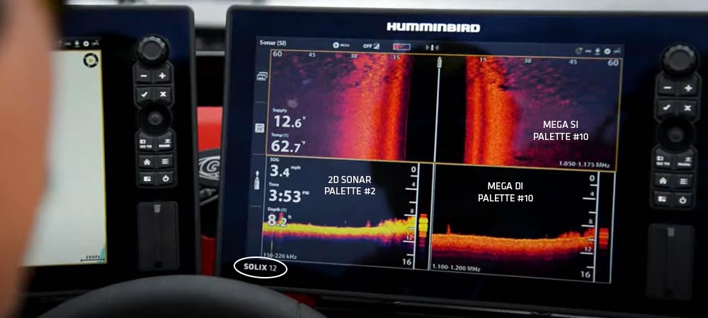
- Chris Zaldain (Product: SOLIX) – I prefer Pink and Yellow. Specifically pink (SOLIX #10) for my MEGA Side Imaging and yellow (SOLIX #11) for my MEGA Down Imaging and a red/yellow/black (SOLIX #2) for my 2D sonar. These pair especially well for me with yellow-tinted sunglasses and overcast skies – but are great all-around colors for my eyes.
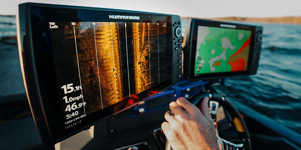
- Kevin VanDam (Product: HELIX) - Without a doubt, my go-to palette is the Humminbird Amber palette (HELIX #2) for my MEGA side, down, and MEGA 360 Imagingâ„¢. This color palette pairs really well with my favorite Oakley Prizm shallow water sunglasses. They have a light amber lens with a green mirror. The amber color palette seems to pop great in both sunny or cloudy situations. I also like experimenting with green and blue palettes, which are nice on darker days or when fishing or scouting near shell beds or small gravel areas. I often try different color palettes while I'm graphing to see what looks best based on the lake's bottom composition. I've used the amber color for so long and it's what I'm used to seeing the little details.
- Keith Combs (Product: HELIX) - I prefer the standard Humminbird Amber palette (HELIX #2) for my MEGA Side Imaging. It really helps me pick out hard spots and also shows the shadows of suspended fish really well. I typically use the green palette (HELIX #5) for my MEGA Down Imaging. I like it because it contrasts really well against the black background and helps me pick out even the smallest details.
- Carl Jocumsen (Product: SOLIX) - I prefer the Humminbird Amber (SOLIX #2) and a darker amber/red palette (SOLIX #3) for my MEGA Side Imaging and green (SOLIX #5) for MEGA Down Imaging in most situations as well as yellow (SOLIX #11) if I want better definition of bottom hardness. I absolutely love the copper/amber (SOLIX #15) for my 2D sonar palette - I run this on both my console and bow units.
How to Pick the Best Color Palette for Your Fish Finder

The best thing to do is hit the water try out different palettes on different lakes and even different areas of that body of water. See what it looks like to you in soft and hard bottom and aim to find something that works for you in many conditions and lake types.
You'll notice that when you boot up a Humminbird fish finder for the first time, your side and down imaging views will have the Amber color palette selected by default (#2 on SOLIX and #2 on HELIX units).

We've found that this color palette is a great all-around color for most people in most conditions. A large percentage of anglers will leave the color palette set to default, but there are many other options to suit your preferences or fishing situations.
For those who are color blind, distinguishing between different colors can be difficult. Typically the best palettes are those that use grey and white, which are #6 and #7 on HELIX. This is a good starting point, but give all of the palettes a try.
It's all about testing your eyes based on conditions. Cycle through a few different palettes when you're on the water next and narrow down a select few that work best for you.
Focus on areas with a variety of cover like rocks, grass, muck, and sand – like we've said, the look of a particular palette will vary depending on location.

"When someone comes up to me and asks what color they should run for Side Imaging to get the best detail possible, well, it's already showing you that – it's the way your eye looks at those colors" – Chris Zaldain
It's important to pick a good color palette to get the best detail out of your fish finder, but it's not something you need to overthink. One particular color palette may look great to you but your fishing buddy may not agree, and that's okay.
At the end of the day, choose the one that looks best to your eyes!
Interested in more educational resources like this? Make sure you subscribe to the Humminbird newsletter for updates on the latest products, technologies and educational resources.


